Dermatique
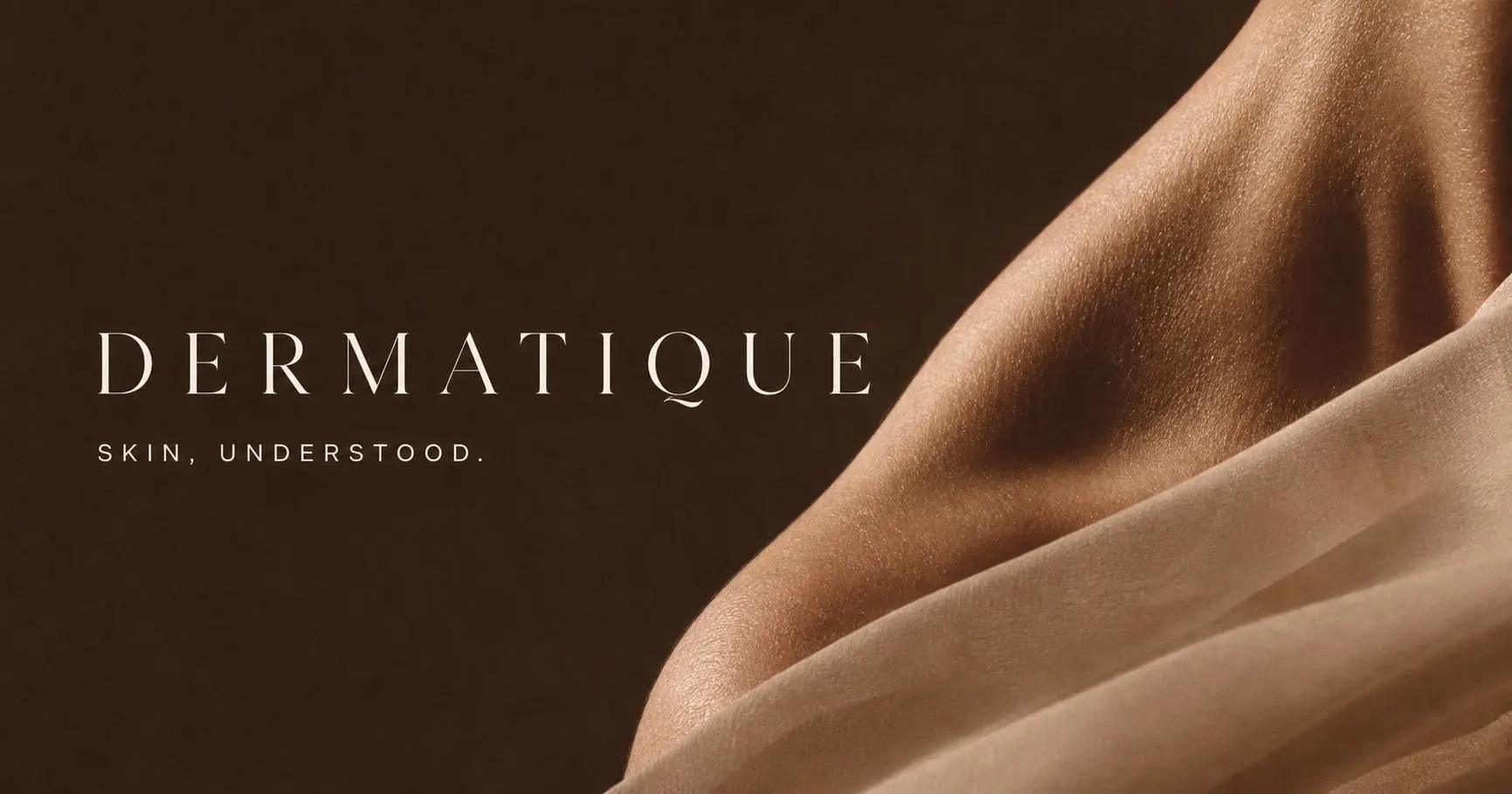
Dermatology,
without the drama.
Overview
Dermatique is a fictional skin clinic at 12 Kensington High Street.
The project began backwards.
Instead of designing a brand and then imagining how it might appear online, I started with a finished website direction and worked backwards to build the identity that could have produced it.
The problem
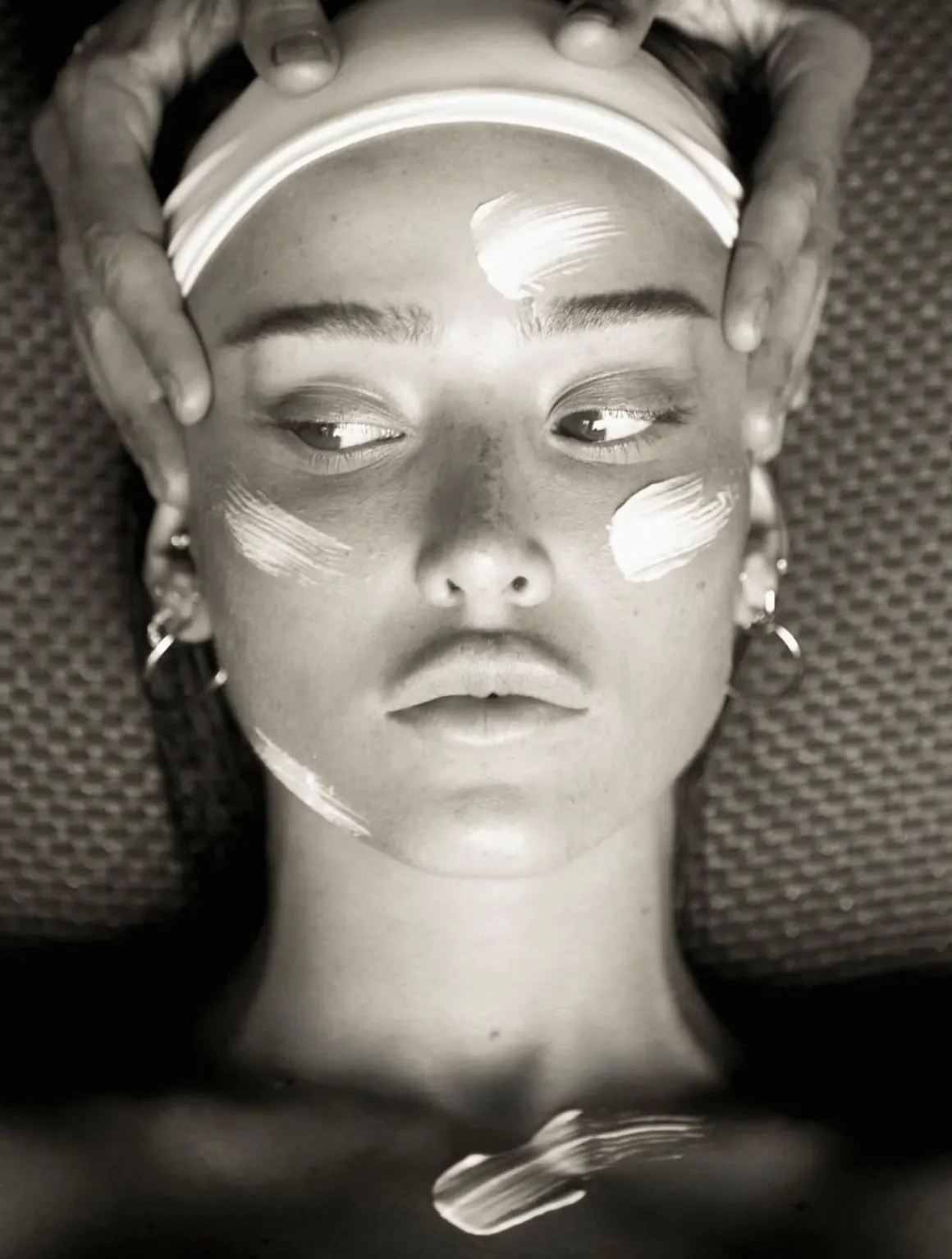
A lot of aesthetics brands use the same visual shorthand.
- Cream backgrounds.
- Thin serif type.
- Leaves.
- Line drawings of faces.
- A lot of language about journeys.
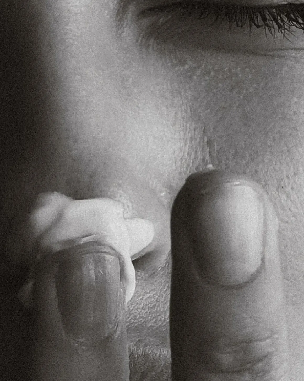
Dermatique needed another route.
Identity
The identity is restrained, but it isn’t delicate.
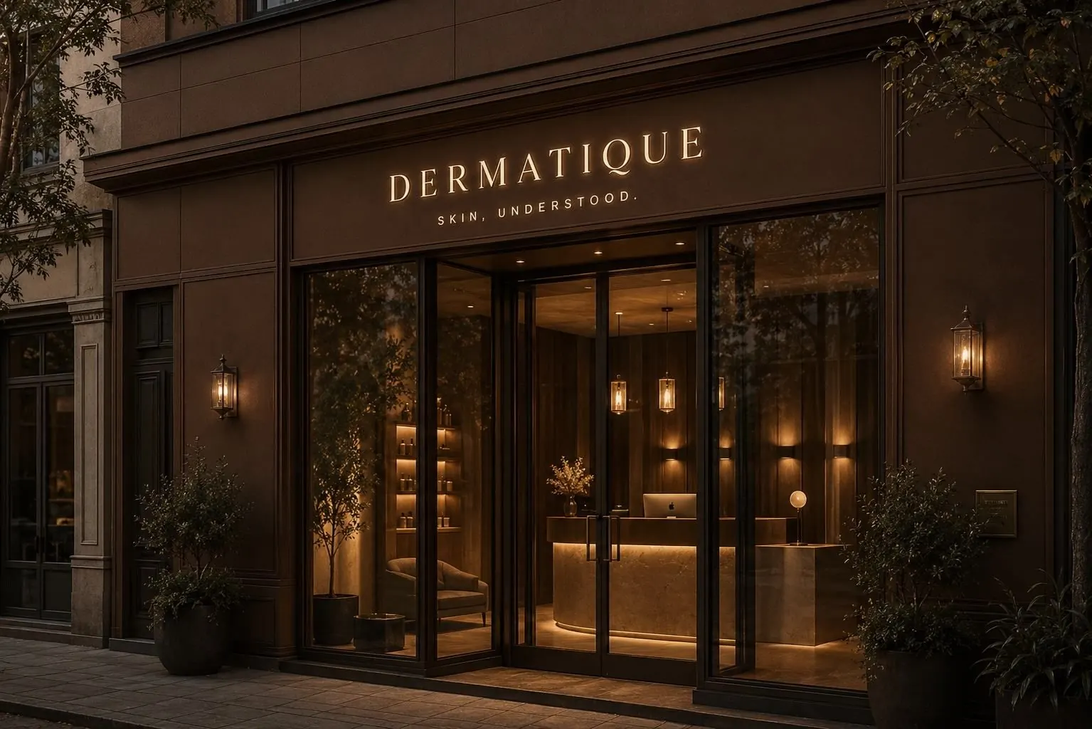
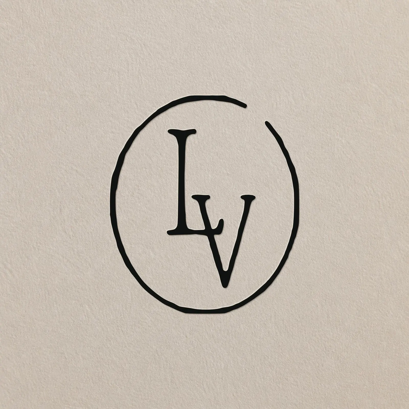
A sharp wordmark and monogram give the clinic enough authority to sit comfortably in a medical setting while still belonging to beauty and skincare.
The supporting system is deliberately sparse.
Strong typography does most of the work.
Treatments
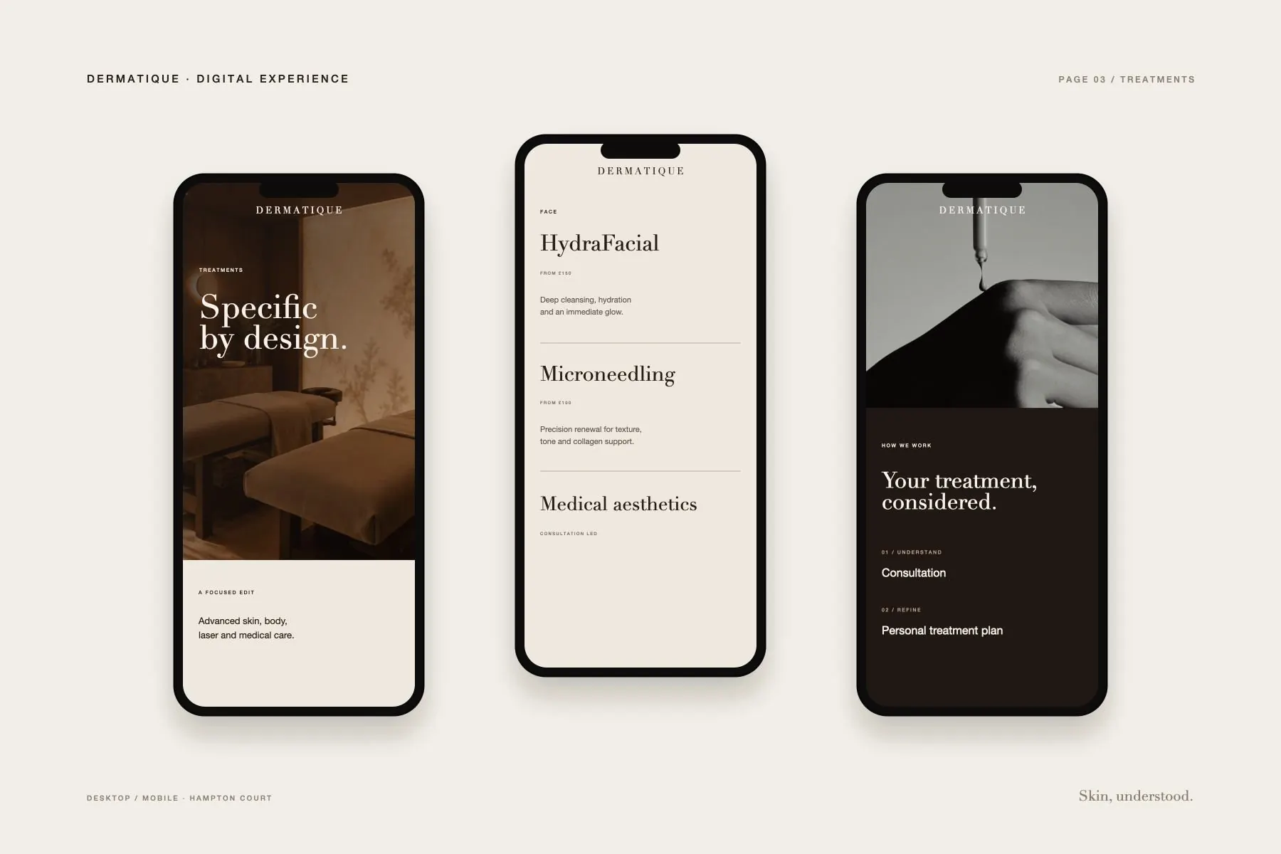
The treatment menu is treated as part of the identity rather than an administrative document.
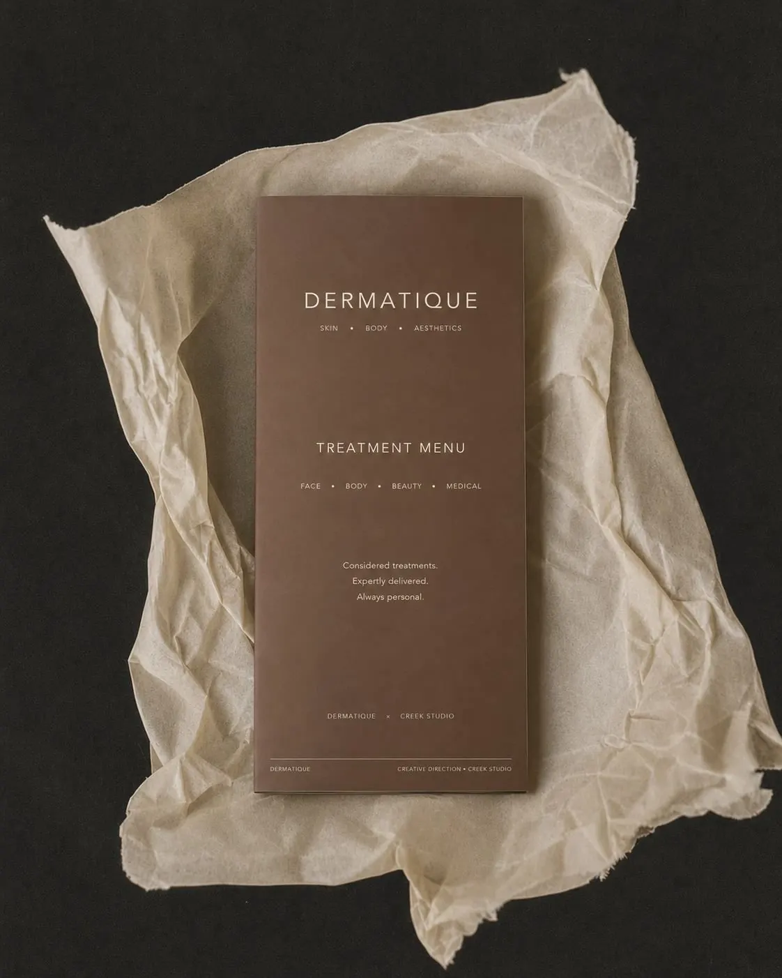
Spacing, hierarchy and typography are doing the heavy lifting.
Treatment names and prices stay easy to scan, with branding kept quiet enough that the information remains the point.
Product
A small range,
treatment only.
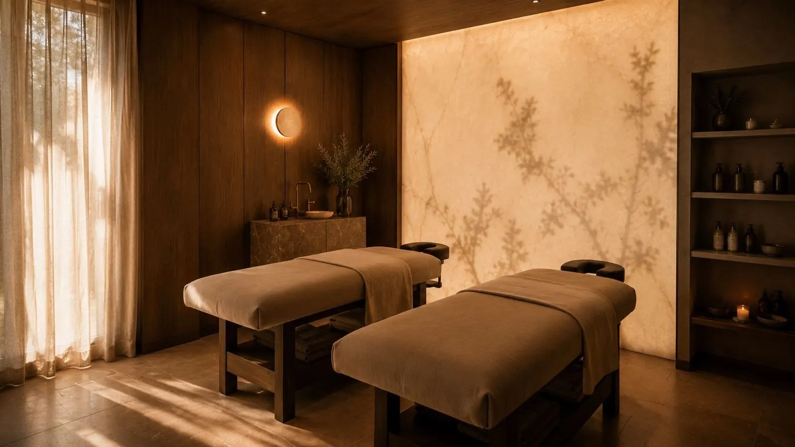
No elaborate consumer launch. No wall of twelve nearly identical bottles.
Products begin inside the clinic and are recommended when they make sense for the treatment.
A public range can come later.
Digital
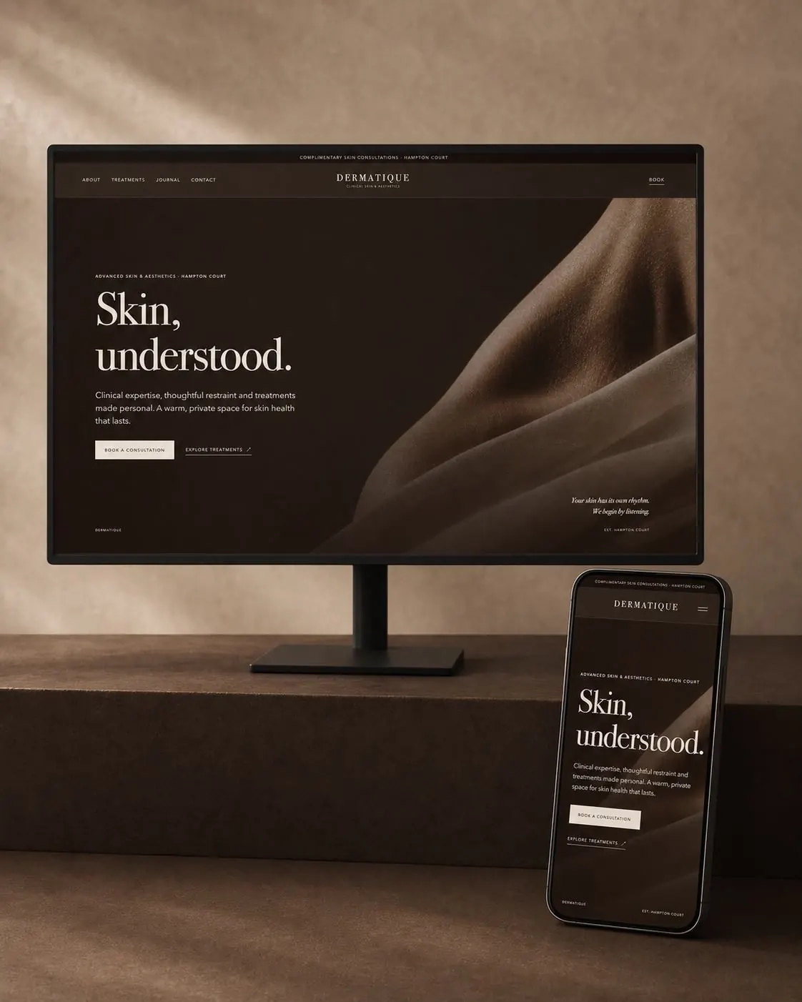
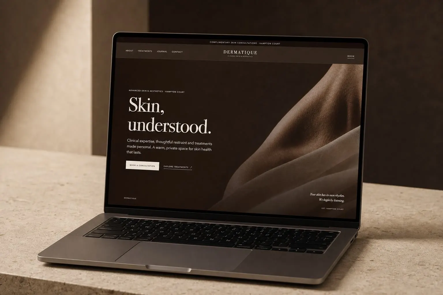
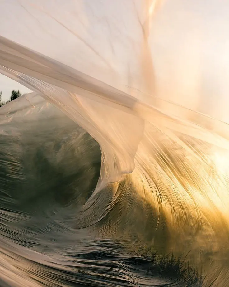
The website uses large imagery, disciplined typography and plenty of room around both.
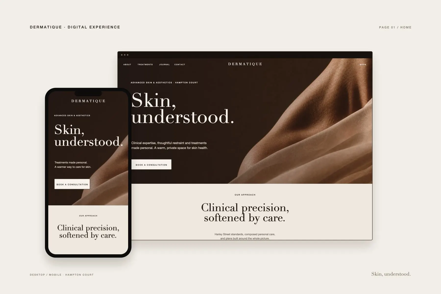
Clinical information is written plainly and the route to treatment information stays obvious.
The job of the site is to make choosing and booking less confusing.
Looking good is allowed too.