Black Dawg Coffee
Serious about coffee.
Not much else.
Overview
Black Dawg started with the dog.
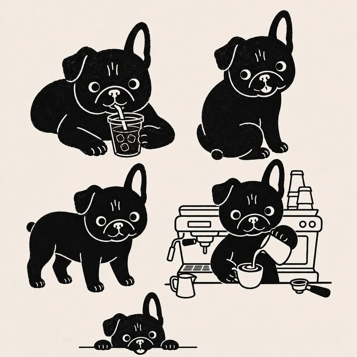
More specifically, a French bulldog with one ear up, one ear down and enough expression to carry a brand without becoming a children’s mascot.
The concept grew into an independent riverside coffee shop in Kingston, with the identity extending across the café, packaging, retail coffee, merchandise, campaigns and its website.
The idea
Coffee branding has become very good at looking tasteful.
It has also become quite easy to confuse one brand with another.
Black Dawg goes in the opposite direction. The mascot is obvious, the writing has personality and the brand is allowed to be funny.
The coffee still has to look good enough for someone who cares deeply about coffee. The identity simply doesn’t require them to act solemn about it.
Identity
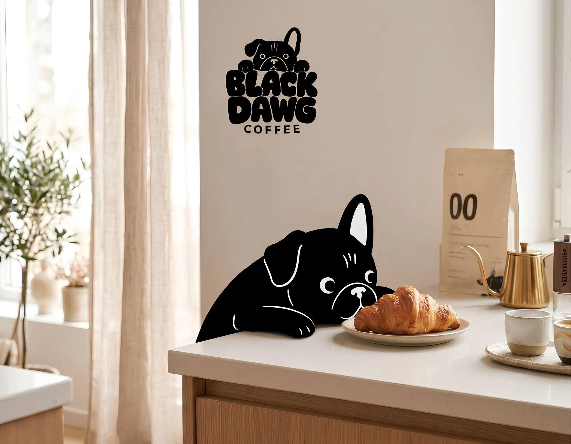
The main logo combines hand-drawn bubble lettering with the Black Dawg mascot peering over the top.
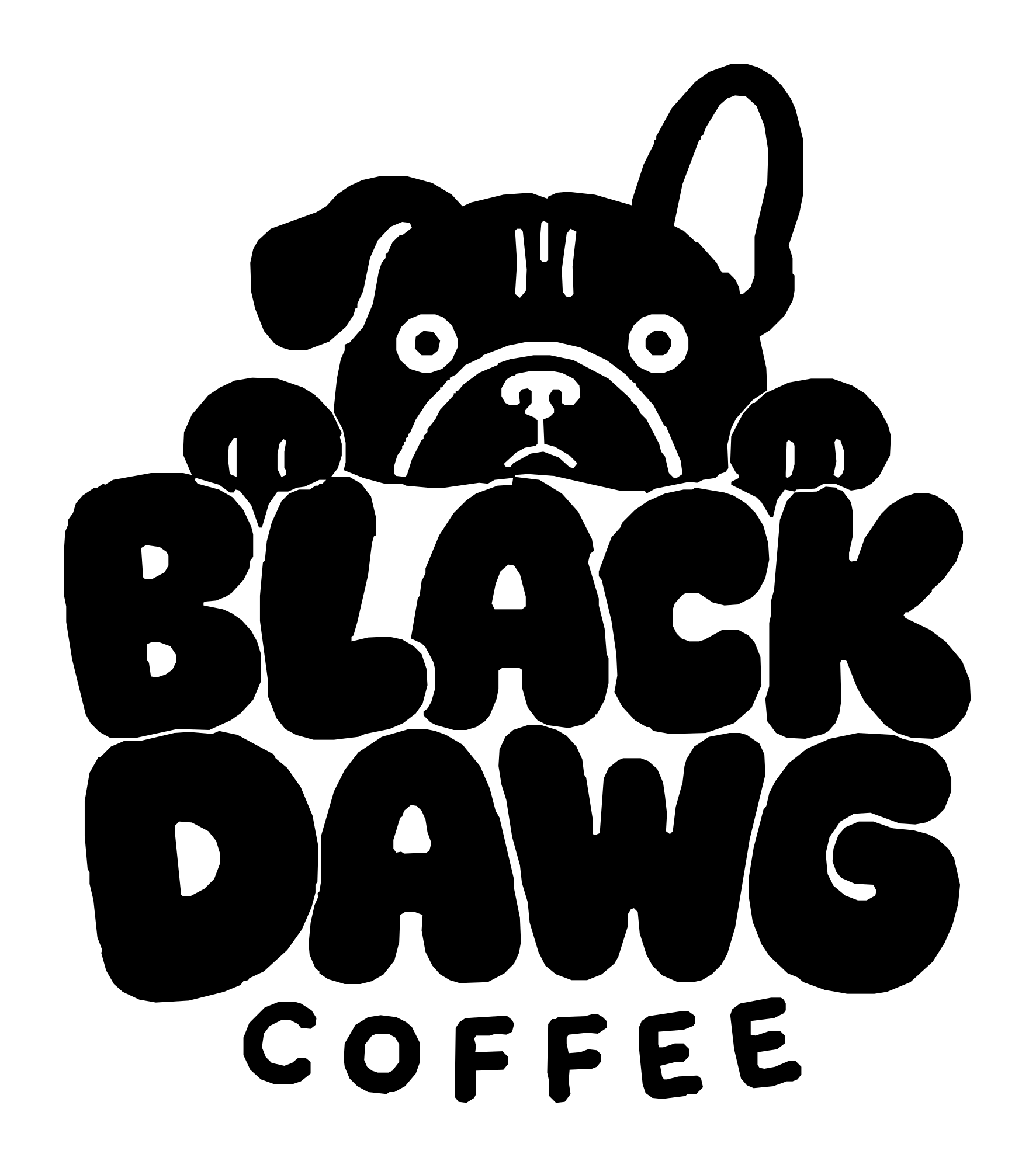
One ear stays up. One stays down.
That detail became important very quickly.
A simpler type system sits underneath the hand-drawn mark, giving menus, packaging and the website enough structure without cleaning all the character out of it.
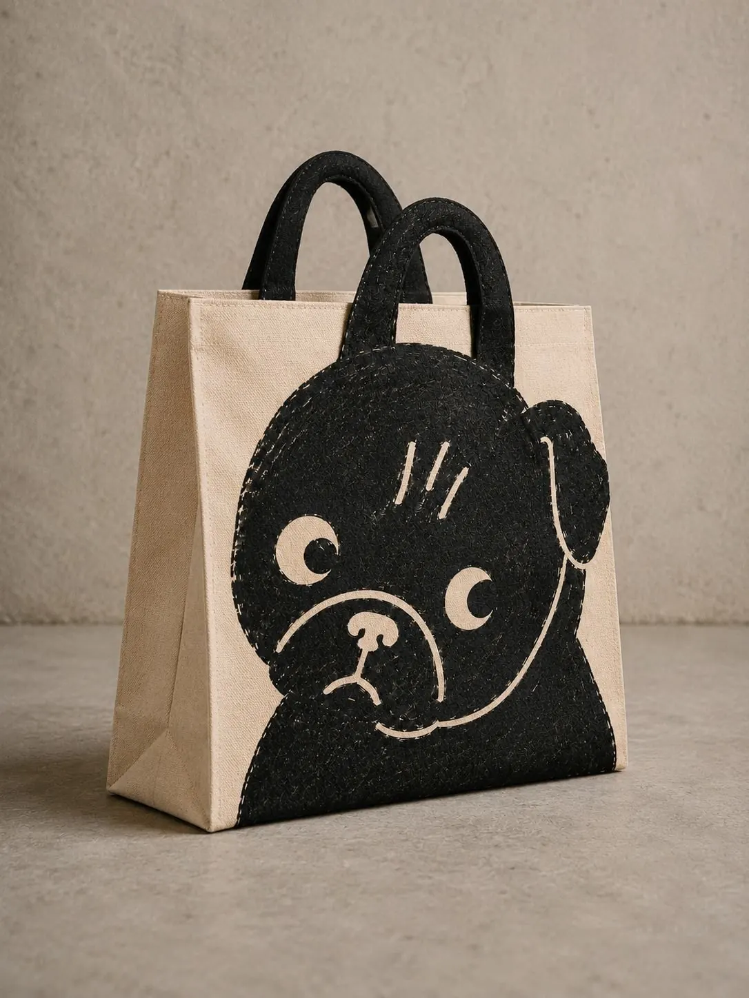
The café
The imagined first Black Dawg sits on Kingston Riverside.
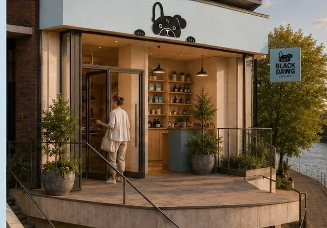
The exterior is intentionally simple: a pale shopfront, the mascot appearing above the fascia and a hanging sign carrying the full mark.
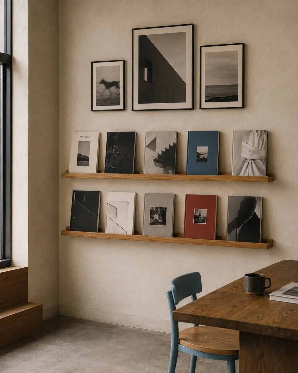
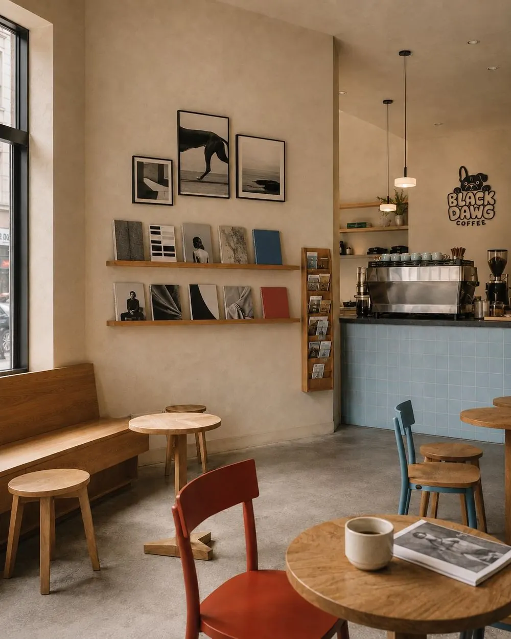
Inside, the space is closer to someone’s very well-edited living room than a pristine coffee laboratory.
Books, pictures and collected objects give it some mess. The terrace opens towards the river.
Dogs are expected.
Menu
The menu is split into two double-sided sets.
Instead of forcing everything into a rigid restaurant grid, items are scattered across the page with small illustrations, coffee marks and occasional appearances from the dog.
Easy to read. Allowed to have some fun.
Black Dawg at Home
The retail range gives the coffee a simpler numbering system:
Light
Dark
Decaf
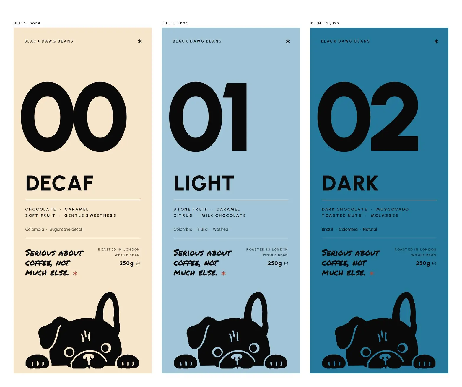
Seasonal coffees can come and go without rebuilding the whole range.
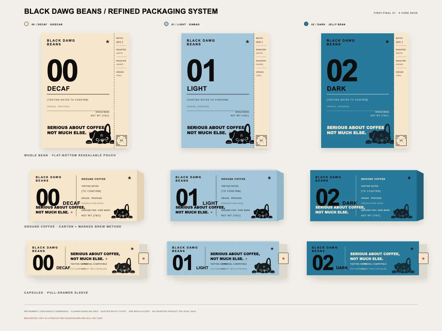
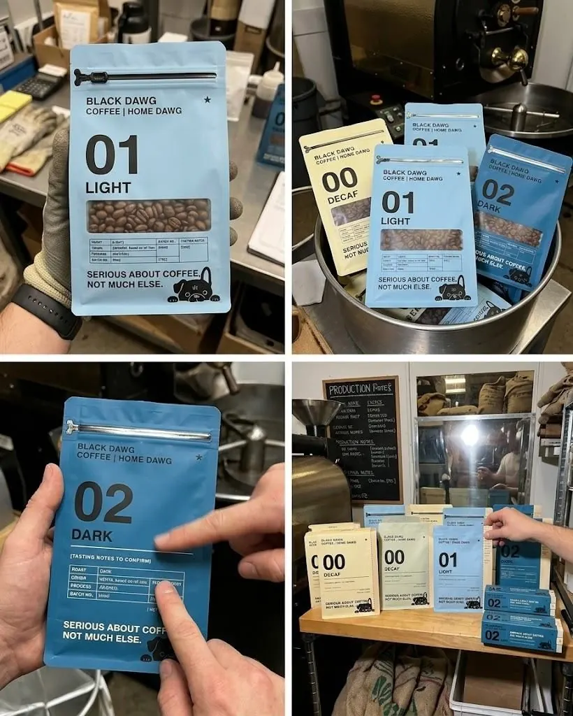
Beans, ground coffee and pods all use the same underlying packaging system.
Good Dawg Fund
Part of the Black Dawg concept is a simple give-back model.
The intention is to connect the two places the brand depends on without turning either into a marketing prop.
Campaign
Get your paws on
some really great coffee.
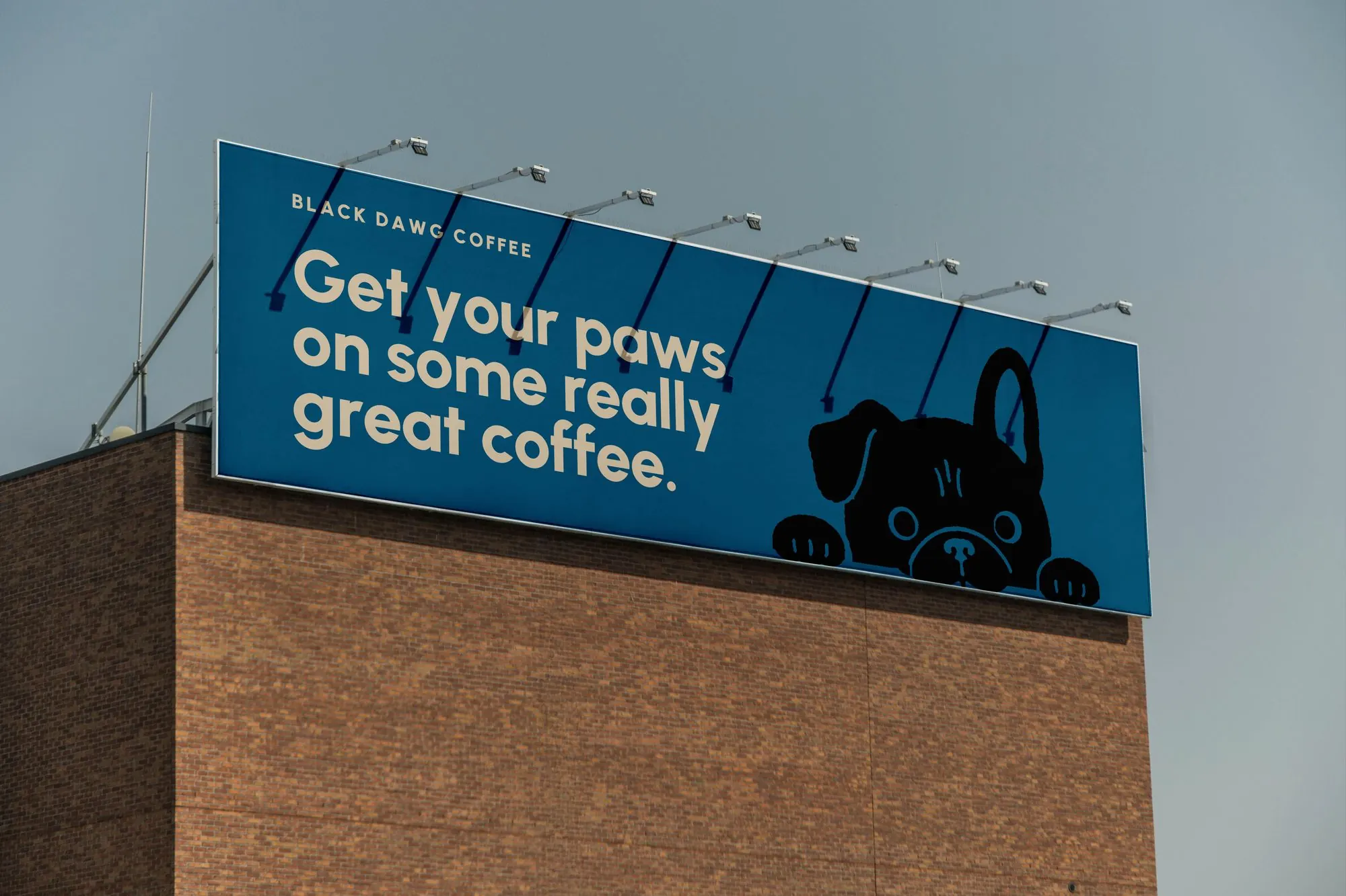
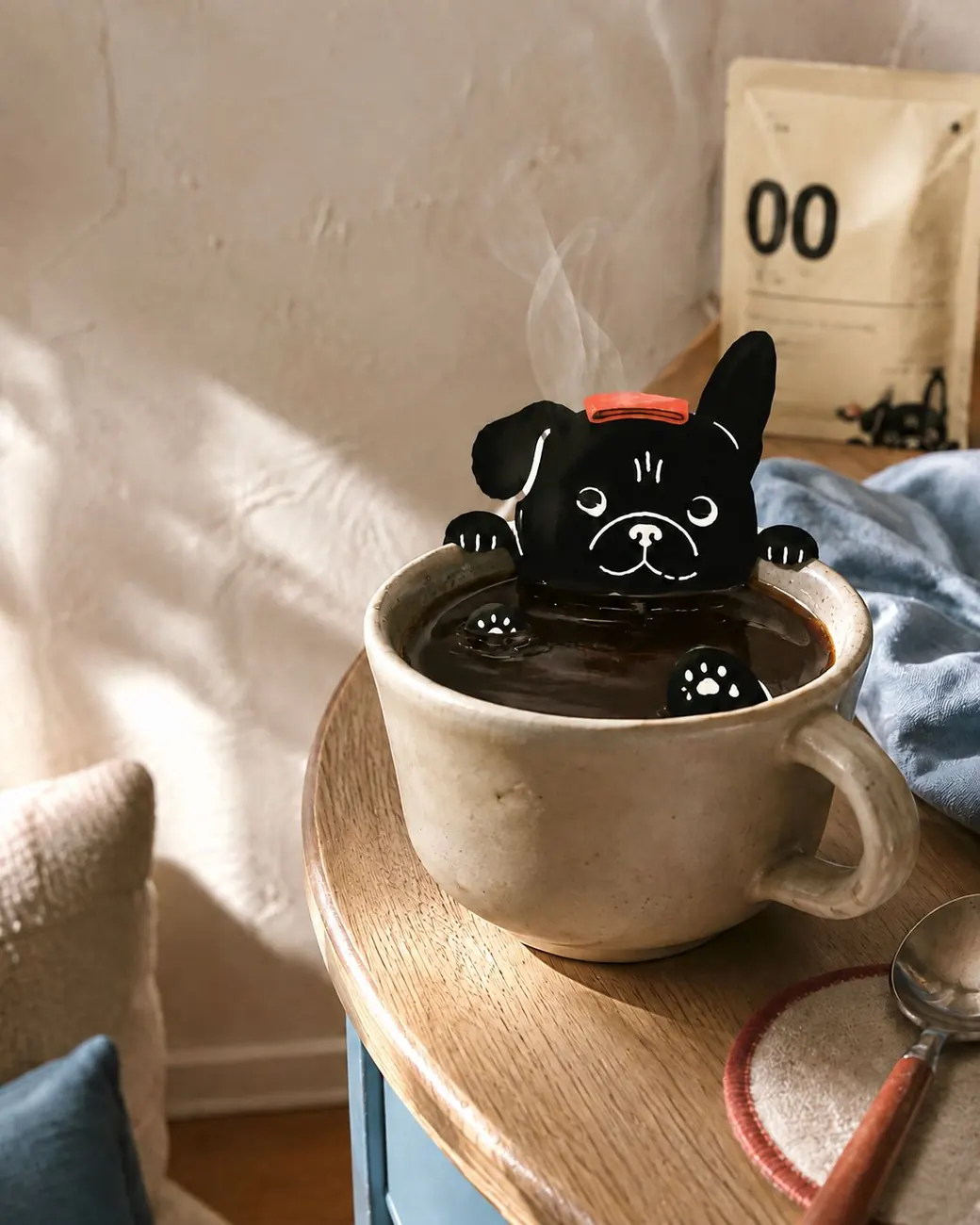
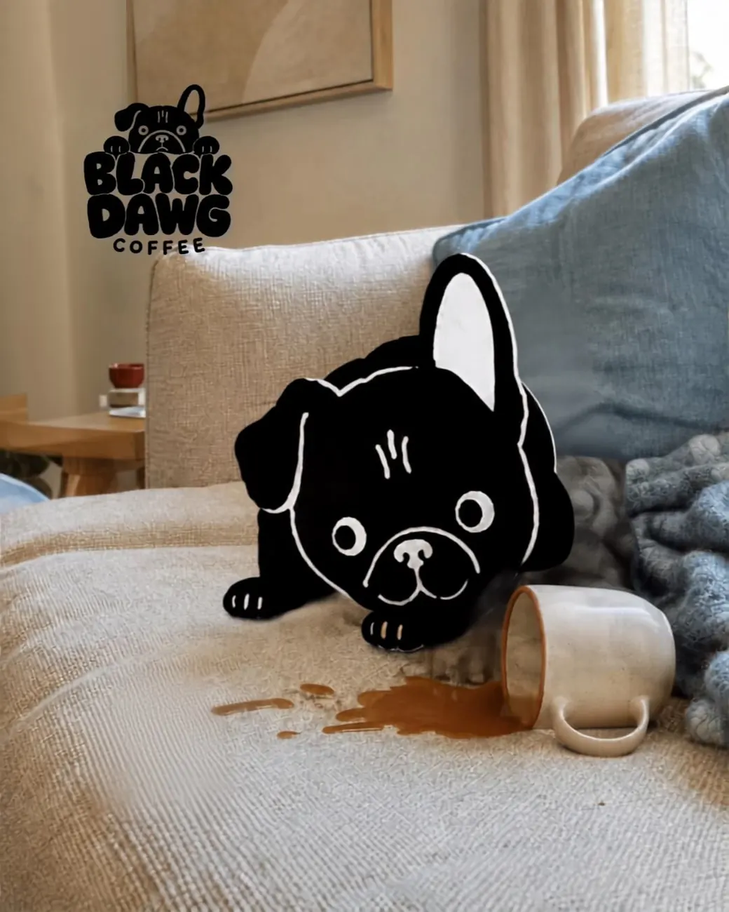
The campaign treats the mascot like the badly behaved face of the company.
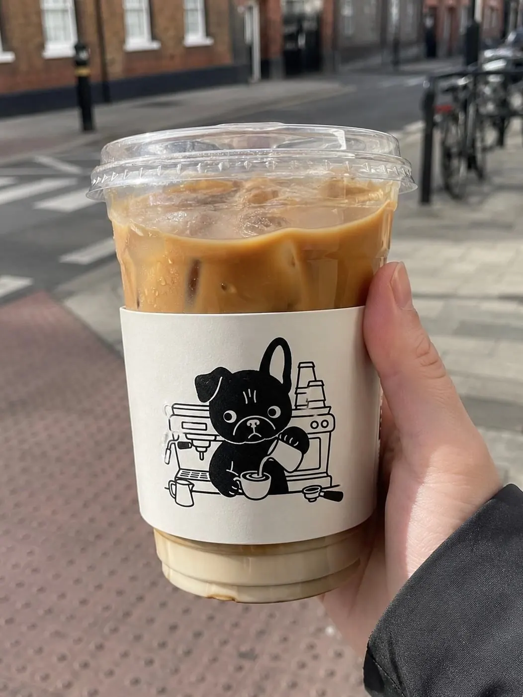
He appears inside cups, noses around pastries, knocks over mugs and generally interferes with carefully arranged product photography.
Exactly as a French bulldog would.
Website
Bad Dawg. Great coffee.
The site carries the same balance as the identity: useful first, character everywhere else.
Coffee, food and locations are easy to find. Animation is kept for small moments where the dog can interrupt proceedings.
Journal content and DAWG AT HOME extend the brand beyond the café.